Coursemojo
Creating a stronger design system to empower students and improve their grades -
alongside a focus on messaging within the classroom.
Role
Product Designer
Employer
Coursemojo
Platform
Web
Areas
Strategy, Design
Background
Building the platform to combat COVID-19 contributed to engineers creating the design, to expedite the product. Since the beginning, the focus has been on marketing the company and creating clientele, while shelving a revisit to the interface and user flow. Eventually, there was a realization that lack of focus on the design was impacting student success.
By utilizing the data from online classes and surveying the students, I was able to have a strong initiative to improve accessibility and student grades. In 2022, both the clients and the company were excited about a stronger visual direction, and I had to plan it out so that it could continue to grow past my time there.
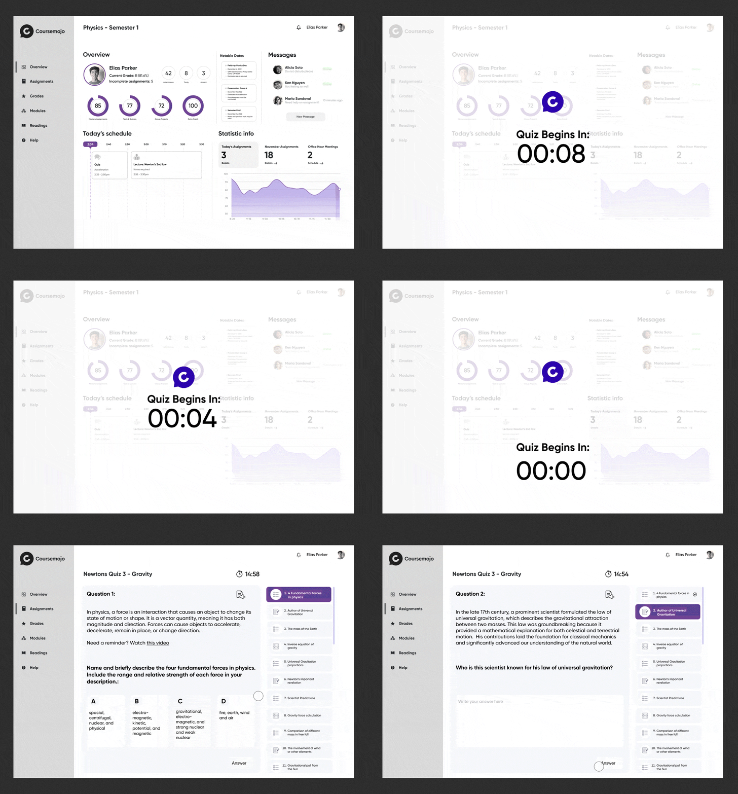
Adding automated timers for events assisted in student user flow
Animations added for visual navigation
Approach
After the surveys showed that 96% of students did not utilize the home page, we inquired about what was fundamental and a priority after the login. By gathering that data, we could capture a clean dashboard to reflect valuable information which also created confidence in their learning.
I realized that the page flooded the user with global information with numerous tabs and functionalities that were not explained or useful. From a visual standpoint, the lack of hierarchy and strategic color usage presented information that was deprived of a natural user flow or priority.
I noted that not only should I do a comparative analysis of other platforms, but I also want to note the popular navigation tools that pre-college students are familiar with. Some takeaways of what made them successful included:
Well-structured navigation
Informative data that is actionable
Data presented in filterable timelines
Insights shown at different milestones
Surveys were conducted with 3 schools based on what daily features were most important which will influence the interface
Revamped the design system to simplify the experience for children
Improved scalability for better responsiveness and hierarchy
Obstacles
I quickly realized that testing against standard WCAG practices was insufficient in a school setting. The main clientele had demographics of students with Individualized Education Programs (IEP), English Language Learners (ELL), and various social and economic disabilities.
Not only did we need to design the program to meet accessibility standards, but we also had to ensure that the entire student spectrum could be set up for success.
I focused more on communication and visual organization. We added Test-to-Speech, font sizing, automated translation documents, improved caching, and minimized content lengths.
Impact
In addition to creating a design-led UI system, building a modular visual language, and strengthening the navigation, we set these goals as benchmarks for success. These metrics would be the basis for what the company will highlight for new clients.
Retention Rate
+31%
WCAG Access
>2.1
Avg GPA Improvement


